The J-Beauty Pop-Up Test
That Drove 2× More Revenue for Kiyoko


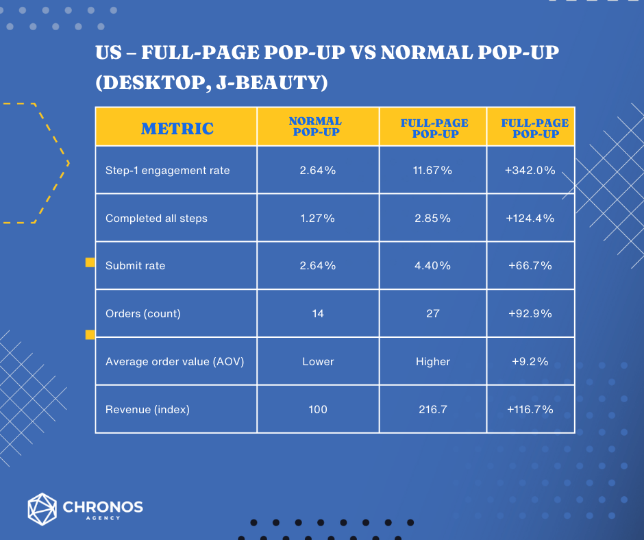
66.7%
increase in email submit rate
(US desktop, J-Beauty pop-ups)
(Full-page variant vs. regular pop-up, Chronos-attributed)

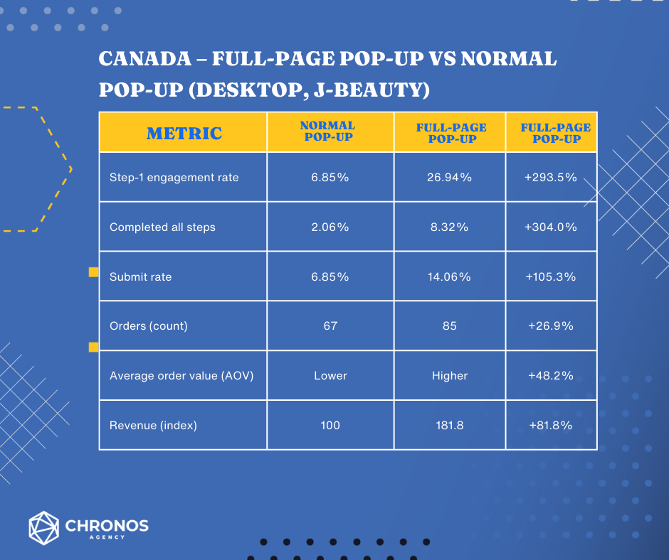
105.3%
increase in email submit rate
(CA desktop, J-Beauty pop-ups)
(Full-page variant vs. regular pop-up, Chronos-attributed)

2.17×
improvement in pop-up–attributed revenue (US)
(Full-page variant vs. regular pop-up, revenue index)
Kiyoko swapped their standard “free shipping” pop-up for a full-screen J-Beauty quiz experience. In under a month, email submit rates jumped 66–105%, and pop-up–driven revenue climbed 82–117% across US and Canada desktop traffic.
The twist? The winning pop-up didn’t lead with a discount. It led with an easy, playful question.
The Story
Kiyoko is a fast-growing K- and J-Beauty retailer with a heavy focus on US and Canadian customers. For August 2025, the team wanted to see if a more immersive, J-Beauty–themed experience could pull in more qualified email and SMS subscribers than their existing “first order free shipping” pop-up.
Competitor research showed several brands running full-page takeovers with a light personality question and large product imagery. That sparked the idea: what if Kiyoko turned their pop-up into a mini quiz that felt fun first, transactional second?
The Problem
The Australian market has been hit with several economic challenges in 2023 making it harder for many brands to stay profitable. With the increasing inflation, business costs increased – making the profit margin of brands lower. This is a serious situation for brands like AFW which only have small profit margins. AFW offers warehouse pricing. They provide high quality furniture priced at up to 80% less than other retailers.
Despite all the market challenges, AFW was able to outperform 2022’s email marketing performance.
The Goal
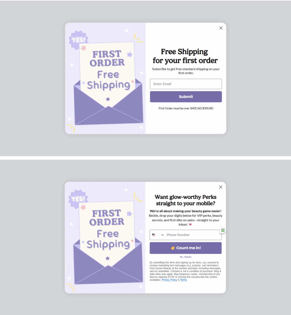
The existing “regular” pop-up was doing what most pop-ups do:
- Half-screen layout on desktop
- “Free shipping for your first order” headline
- Single step asking for email, followed by a second step for phone
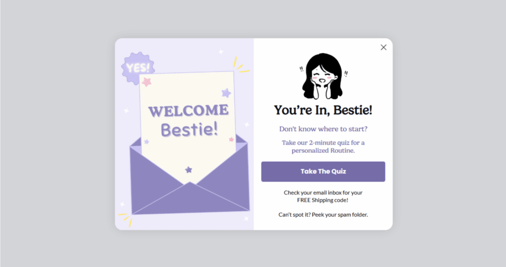
- A final “You’re in” state pushing users into a skincare quiz
It was clear and on-brand, but performance had plateaued. Many visitors simply closed it without engaging, and there wasn’t a strong hook beyond the discount. Kiyoko wanted:
- More people starting the funnel
- More people finishing the funnel
- More orders and revenue clearly tied back to the pop-up experience
The Framework / Strategy
1. Turn the pop-up into a J-Beauty quiz
The full-page variant was a complete takeover, built around a soft personality question and bold J-Beauty imagery.
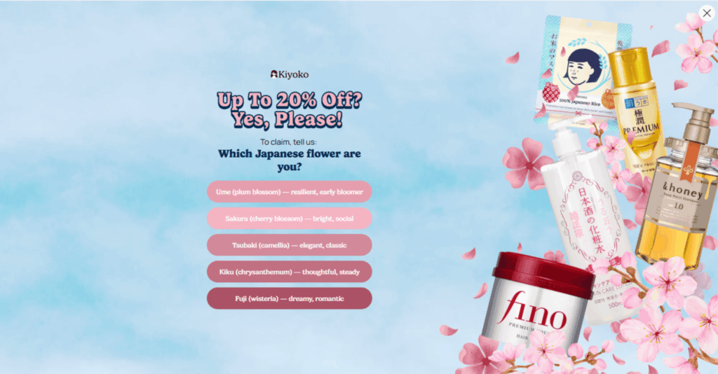
Step 1 – “Which Japanese flower are you?”
- Large hero image with J-Beauty products and cherry blossoms
- Headline: “Up to 20% Off? Yes, please!”
- Light quiz question: “Which Japanese flower are you?” with multiple playful options
No form fields yet — just an easy, curiosity-driven tap.
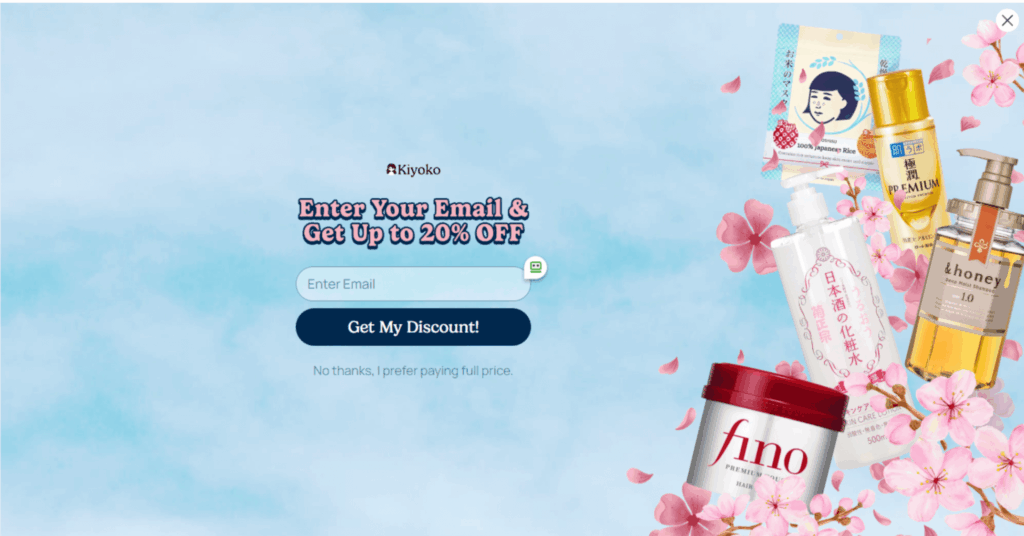
Step 2 – Capture the email
- Headline: “Enter Your Email & Get Up to 20% OFF”
- Single email field and a bold “Get My Discount!” button
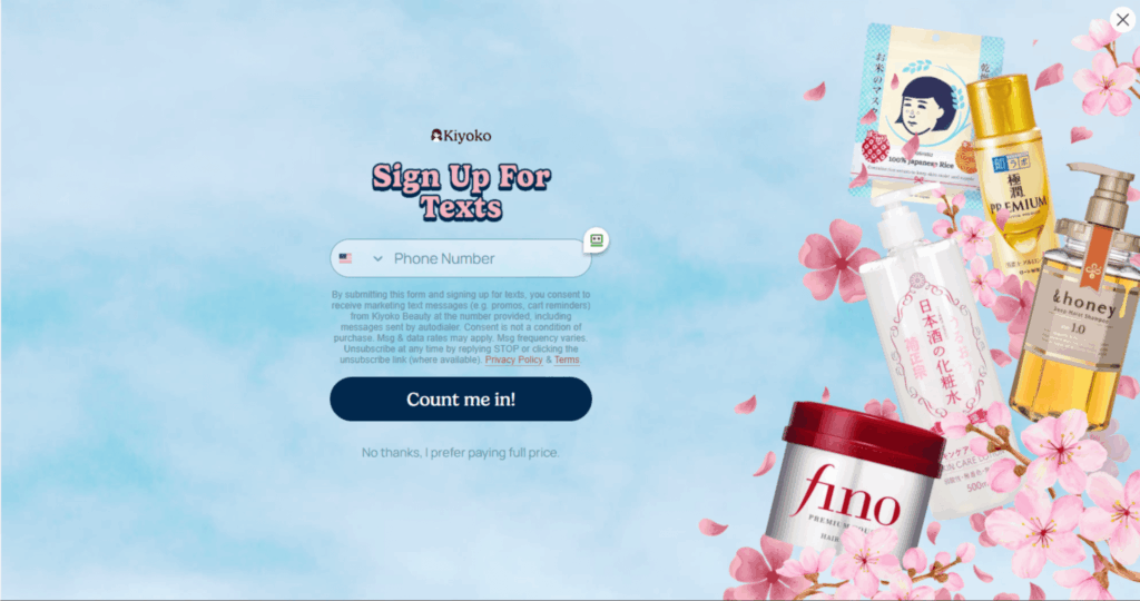
Step 3 – Capture the phone
- Headline: “Sign Up For Texts”
- Phone number field plus compliance copy and “Count me in!” CTA
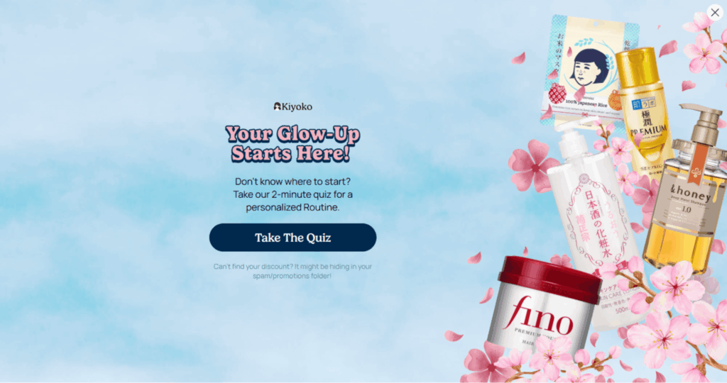
Step 4 – Push into deeper personalization
- Headline: “Your Glow-Up Starts Here!”
- CTA: “Take The Quiz” for a 2-minute personalized routine assessment
This structure used the first step to create commitment, then layered in email, SMS, and finally a personalized routine quiz.
2. Run a clean 50/50 A/B test
In both US and Canada, Kiyoko tested:
- Variant A: Full-page, multi-step J-Beauty quiz pop-up
- Variant B (control): Existing two-step “free shipping” pop-up with welcome state
Key testing details:
- Split: 50/50 between full-page and normal pop-ups, per region
- Triggering: Shown after 5 seconds on page
- Frequency: Once per day per user
- Exclusions: Existing profiles were excluded
- Device: Desktop only
Statistical rigor: Platform auto-selected a winner after significance was reached in each region
3. Track the entire funnel
Kiyoko monitored:
- Unique views
- Step-1 engagement rate (people who interacted with the first step)
- Completion rate for all steps
- Submit rate (final email/phone submission)
- Orders
- Average order value (AOV)
- Revenue
Full Page Pop Up
Step 1
Step 2
Step 3
Step 4
VS
Regular Pop up
The Result
Test window
- US desktop J-Beauty pop-ups: Aug 6–31, 2025 (25 days)
- Canada desktop J-Beauty pop-ups: Aug 13–31, 2025 (18 days)
Both tests reached statistical significance.
Performance by region
How it changed the business
- Top-of-funnel engagement exploded. Step-1 engagement more than tripled in both markets once the first touch shifted from “Fill out this form” to “Answer this fun question.”
- More people made it through the funnel. Completion rates for all steps more than doubled in the US and more than tripled in Canada.
- Revenue followed the engagement. Higher submit rates meant more orders and materially higher pop-up–attributed revenue in both markets.
As a result, Kiyoko chose to roll out the full-page format to all desktop pop-ups in the US and Canada.
The Big Win
The big unlock was moving the “ask” to step two.
By starting with a low-friction, curiosity-driven question (“Which Japanese flower are you?”) and strong J-Beauty visuals, Kiyoko made the pop-up feel like content, not a form. Once a visitor had clicked an answer, they were more willing to:
- Enter their email to claim up to 20% off
- Share their phone number for texts
- Take a short quiz to personalize their skincare routine
That single shift — question first, form second — turned a standard discount message into a mini on-site experience that:
- Hooked more visitors at the very first moment
- Increased commitment step by step
- Made the eventual ask feel like a natural next step, not a speed bump
Ready to turn your “meh” pop-ups into revenue engines?
Ready to get started?
Let’s discuss how we can help your eCommerce business thrive! Book a call today to discover the power of lifecycle and retention marketing for long-term growth.
Book a call
Subscribe to our newsletter
Get our latest blogs direct to your inbox
The Results
66.7%
increase in email submit rate
(US desktop, J-Beauty pop-ups)
Full-page variant vs. regular pop-up, Chronos-attributed)
105.3%
increase in email submit rate
(CA desktop, J-Beauty pop-ups)
(Full-page variant vs. regular pop-up, Chronos-attributed)
2.17×
improvement in pop-up–attributed revenue (US) (Full-page variant vs. regular pop-up, revenue index)
Why It Worked (Repeatable Principles)
- Lead with curiosity, not the coupon.
The first interaction was playful and brand-aligned instead of transactional. For Kiyoko, that meant a personality-style question tied to Japanese flowers and beauty culture. - Use visuals that match the promise.
The full-page design (see page 2–3 screenshots) wrapped the question in J-Beauty product imagery and cherry blossoms. It immediately answered: “Is this relevant to me?” - Break the form into tiny yeses.
Instead of one heavy step, the funnel spread decisions across four light ones: tap an answer → share email → share phone → take the routine quiz. Each yes built on the last. - Protect user experience with smart targeting.
Showing the pop-up after 5 seconds and capping it at once per day reduced annoyance while still reaching high-intent visitors. - Measure the whole funnel.
Looking at Step-1 engagement, completion rate, submits, orders, AOV, and revenue made it clear where the real leverage was — the first interaction. - Use funnel diagnostics to prioritize next tests.
In Canada, 26.94% engaged with Step 1, but only 14.06% submitted. That gap highlights the next optimization opportunity: reduce friction in later steps for even more gains.
FAQ
-
Q1. Won’t a full-page pop-up annoy my visitors?
Kiyoko’s test suggests that when the full-page takeover feels like content (a quiz, a game, or a fun question) instead of a pure form, people actually engage more. Engagement and submit rates went up in both US and Canada. The key is a light, relevant first step and sane frequency caps (e.g., show after a few seconds, no more than once per day).
-
Q2. Does this only work for beauty brands or J-Beauty themes?
The J-Beauty angle made this particular pop-up feel authentic to Kiyoko, but the underlying principle is broader: start with a low-friction “what type are you?” or “help us match you” interaction that aligns with your product. Fashion, food, fitness, home — any vertical where personalization matters can test a similar flow.
-
Q3. How long do I need to run a test like this?
Kiyoko reached significance in 18–25 days per region with clear winners on submit rate and revenue. Your required duration will depend on traffic and conversion volume, but the structure is the same: run a clean 50/50 split, pre-define your primary metrics (e.g., submit rate and revenue), and let the test run until you have enough volume to make a confident call.