Is your eCommerce store’s website seeing a high flow of online traffic…but your conversion rates are still low? Seeing people visit your website is one thing, but if they aren’t converting into anything beyond being visitors, then that’s a bunch of lost conversion opportunities for your store.
You might need to fix your pop-ups.
You’ve got pop-ups, you say? Then tell us…what’s the first thing YOU would do when you visit a website and see a pop-up appear? Don’t lie—you zero in on its ‘x’ button and close it faster than you can blink.
That’s the thing, how do you know your leads aren’t doing the same thing with your pop-ups? It’s time to dive into what you can do to fix that.
Retail strategist Salena Knight aired a podcast episode on her “Bringing Business to Retail” series tackling how pop-ups can make or break your conversions.
Lifecycle marketing engineer Joshua Chin (CEO & Co-founder of lifecycle marketing agency Chronos Agency) was a guest in this episode. He shared his insights on the website pop-up best practices you should follow to fix your conversion rates
As they’ve discussed in the podcast, just slapping on a bigger discount and forgetting about your pop-up isn’t enough. Discounts are great, but everyone in eCommerce offers discounts.
So what can you do to make your pop-ups stand out and capture attention from visitors who’ve seen the same discounts hundreds of times before?
What are the Best Practices for Setting Up Your Pop-ups?
1. Timing is Everything
There are two ways you can time your pop-ups. (1) Hard timers and (2) Scroll triggers. Hard timers are the most self-explanatory but are also, ironically, the hardest to nail the timings of.
“We observed the website of one of our clients and noticed visitors tend to leave their website after an average of 1 minute and 15 seconds without buying anything. So what we did was set their pop-up to appear just before their visitors leave.” —Josh Chin
Josh also recommended that if you notice visitors leaving way earlier than your observed average time, you can use exit intent pop-ups which appear when they sense that your visitors are about to close their browser windows.
You can also use scroll-triggered pop-ups. They appear after your visitors have scrolled down a percentage of your website page. This allows time for your website visitors to explore and learn more about your brand before your pop-ups start doing their thing.
RELATED: 6 Best Practices to Improve the Conversion Rates of Your Email Pop-ups
2. Contrast is Key to Designing an Attention-Grabbing Pop-up
Once you’ve found the timing that works for your brand’s website, it’s time to find the design that captures your visitors’ attention.
What’s the color of your website? Whatever it is, your pop-up should have colors that contrast with your website design in the background.
Combine that with a smart use of transparency to emphasize key elements in your pop-up design can make it visually pop out of visitors’ screens. What’s more attention-grabbing than that?
PS: Use the same principles above to make your pop-up’s CTA button stand out as well.
3. The Right Offer Value can Make a Huge Difference
So you’ve nailed the timing and created the eye-catching design… now for what your visitors look for—the discount offer.
You’ll need to test what discounts work best. Too low can make your pop-up easy to neglect, too high would lessen the perceived value your visitors would have of your brand.
“I have read a lot of stats, and the stats say that the reason why you don’t offer 10% off is simply because it isn’t enough to make someone buy. But it is around 30 to 35% that someone who maybe wasn’t going to buy…will actually switch to buying.” —Salena Knight
4. Use Engaging Copy in Your Pop-ups
Fix up your pop-ups to be a mini-conversation piece. Use copy that encourages your visitors to engage into a sort of pseudo conversation with your pop-up—with their reply being the much-awaited CTA click.
You can also use questions that would get your customers thinking (i.e: “Got a favorite shirt design?”, “Looking for a gift for Mother’s Day?”).
Engaging copy can segue your visitors’ into opting in or making a purchase because you subtly highlighted what they get out of it.
5. Be Mindful of What You A/B Test
It’s easy to get lost in an overwhelming rabbit hole of what to test, especially when everything about fixing your pop-ups feel like they’ll affect your conversion rates.
There are only two things you should pay attention to: (1) Your pop-up’s timing and (2) the offer.
Your pop-up timing is absolutely crucial. Jaw-dropping discounts and eye-catching designs won’t matter if your pop-ups appear too soon (which can be annoying) or too late (missing out on capture and conversion opportunities).For your offer, remember to test and find what discount ranges work best for your brand and your target audience.
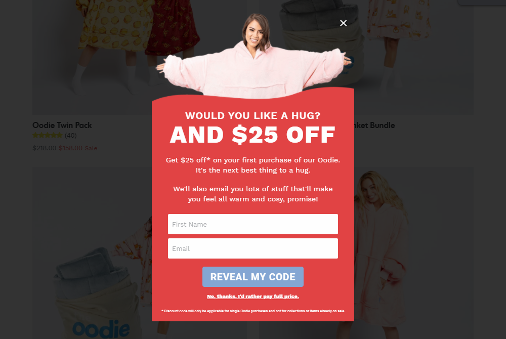
So with all these said, what does a successful pop-up form look like? Josh and his team created a pop-up form for their client The Oodie which actually ended up becoming one of the brand’s top performing pop-up forms!
About this pop-up:
- Strategic use of transparency and contrast (in tandem with the slightly darkened background) made this pop-up design stand out
- Notice the discount offer displayed is 25%, test your discounts and see what works best for your target audience
- The Contrasting color of the CTA button makes it clear and visible
- Copy is short and straightforward with some casual conversational elements to what people get in return for opting in
- The ‘close button’ copy adds a subtle element of FOMO
Bonus Tips
Make it easy for your visitors to close your pop-ups.
If your prospects are just genuinely not interested in your pop-up offer, make the close button clear and visible.
Segment who sees your pop-ups.
Only new customers should be seeing your pop-ups. If your have previous customers revisiting your website or are already in your email list, add them to the list of users who won’t see your pop-ups to avoid annoyance born out of redundancy.
Key Takeaways
Lifecycle marketing is responsible for the long-running and sustainable eCommerce success of many 7 to 8-figure brands.
Customer-centricity is key to future-proofing your DTC store.
Customer retention is more cost-efficient and overall presents a more long-term and sustainable growth solution for eCommerce businesses.
Leverage direct marketing channels to establish direct communication with your customers as well as bring forward products and services that they would be interested in.
Omnichannel marketing is important to help tie all your existing marketing channels together for a seamless and consistent customer experience.

