Now, looks may not be everything. But when it comes to email marketing, design plays a big role in conversion. While your marketing emails may have all the optimized content they need and are aimed at their respective target segments, there’s one more thing you need to think about before sending them—
How does everything look in your marketing emails? And when it comes to the overall design of your emails, you must ask yourself the following questions:
- Are your emails visually appealing?
- Do they have the aesthetic qualities to guarantee full attention-grabbing capabilities?
- Are your email designs aligned with your eCommerce brand?
- Are you maximizing the use of visual media such as images or GIFs?
Just as with content, a lot goes into designing marketing emails that convert. After all, email marketing is all about selling. In order to know how to do email design right, you must first be aware of what would contribute to poor email design. So without further delay—
What are some common mistakes when it comes to email marketing design?
Not optimizing your emails for mobile
Did you know that 81% of consumers use their smartphones when checking their emails? That’s a HUGE chunk of the consumer market. As an eCommerce entrepreneur, it’s your duty to take advantage of your eCommerce platform to properly reach out to those potential customers. How your email designs would look on a desktop screen might not look as good on mobile.
One of the ways you can avoid any compatibility mishaps with your emails on mobile is by making use of mobile-responsive templates.
Forgetting about branding
If there’s one thing in your marketing emails that should stay consistent, it’s how well the email design aligns with your eCommerce brand.
When your potential customers see your emails, they should be able to recognize your brand. If you’re going to use images, they should mostly be of your eCommerce business, products, and people. Your logo should be in an easy-to-spot location in your email so your customers can immediately recognize who the email is from.
Using hard-to-read fonts
While it’s tempting to come up with an email design that will make your brand stand out, some design choices will only make your eCommerce brand stand out for the wrong reasons.
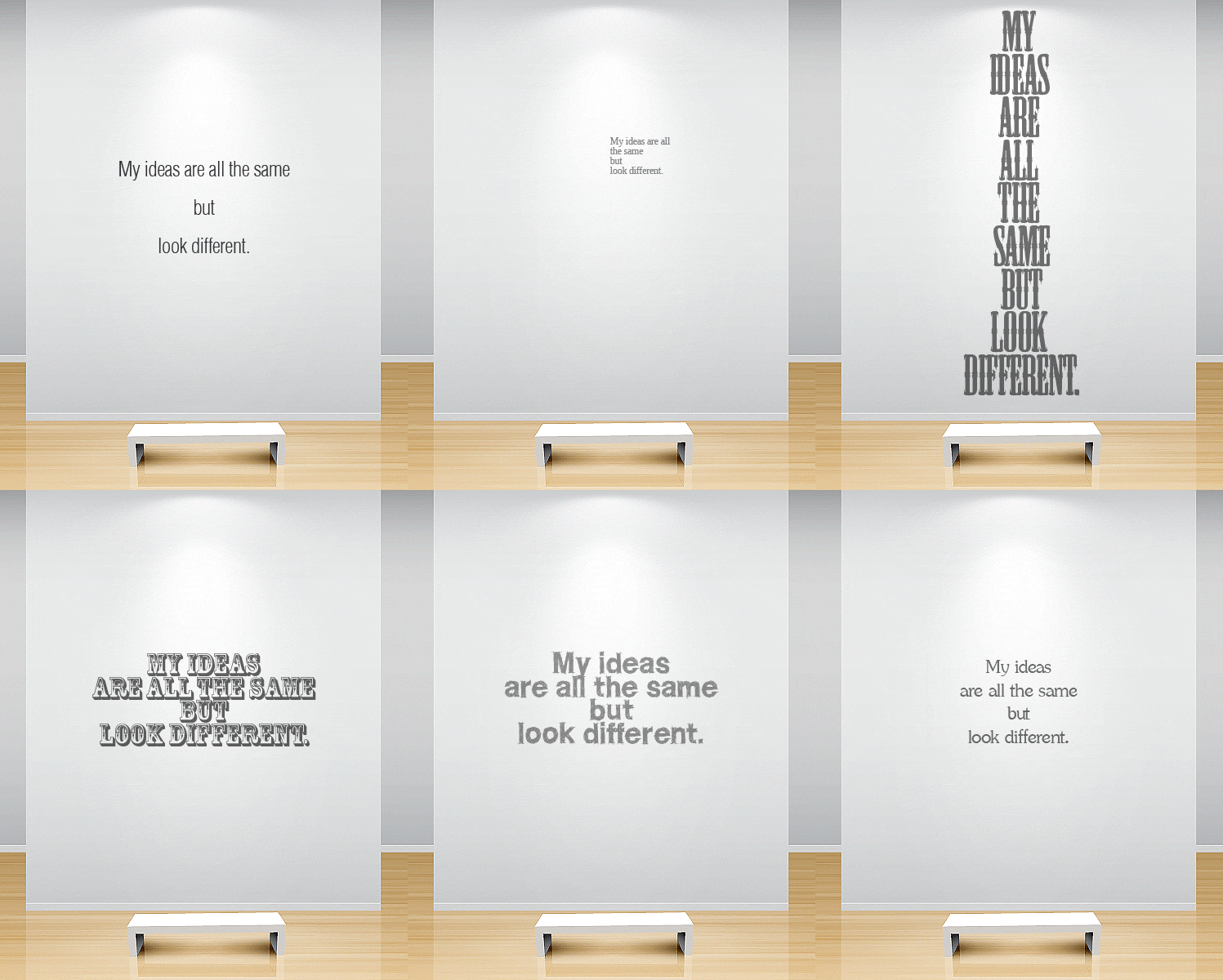
One of the things you need to be careful with is the font style you are going to use for your marketing emails. Opt for the simpler ones that are easier to read, rather than going for the unique and fancy font styles that distract readers or make it difficult for them to read your email content.
Going overboard with the colors
While seeing the world in full color is always a treat, here’s the thing. When it comes to email marketing designs, we would much rather not see every color in a single given space. They don’t really help with conversion anyway.
Stick to using colors that align with your eCommerce brand to help make your brand more recognizable. Using off-brand colors or straight-out just distracting shades of color will only make your potential customers leave and never open any more emails you send in the future.
Not organizing your designs
Designing marketing emails may feel like all you need is creative and artistic decision-making. But in reality, you still need some solid organization skills to make sure there’s a consistent flow of the information presented to your potential customers.
This is especially true for the written content of your emails.
When your potential customers read the first few lines of text, will they continue reading or will they deem it as a waste of their time?
Does your arrangement of information in your emails make sense to your customers? Will they get the gist of your emails in the first few seconds of reading?
The lack or misuse of images
No matter how old people get, they will still prefer to see some pictures here and there as opposed to walls of text.
While images can work as a way to visually represent the ideas you are sharing through your emails, don’t forget to keep them aligned with your eCommerce brand.
Forgetting to add relevant links and buttons to the email design
Email marketing is all about reaching out to your customers, right? But don’t forget to make it a two-way street. If you forget to include relevant links to your online properties like your website and blogs, then you’ll miss out on bringing traffic to your eCommerce store.
Let’s say your emails capture your customers’ interest and they want to check your website out, wouldn’t it be inconvenient if they still have to manually search for your website?
These mistakes may seem small, but they can have a big negative impact on your eCommerce business in the long run.
Now you know what to avoid when it comes to designing your marketing emails.
But you’re also probably thinking why it is so important to mind your email designs. Well, email design is more than just for visual appeal. Great email design can mean the difference between your eCommerce brand’s rise or fall.
How does an optimized email design benefit your eCommerce business?
Optimized marketing email design is all about smart email design.
While it’s important to keep everything visually pleasing and attractive, it’s also important to make use of several design tactics to really maximize the conversion rates of your marketing emails.
But how exactly does smart email design benefit your eCommerce business? Let the numbers speak!
- Adding GIFs to your emails has shown a 103% increase in conversion rates
- Personalized CTAs have 42% more conversion rates than generic ones
- Adding videos to your emails can increase your click-through rates by a whopping 500%
- Responsive design emails would see a 21% higher click-to-open rate than non-responsive designs.
- 63% of mobile consumers would be more interested in making a purchase when they receive email optimized for their mobile devices.
As you may have noticed, all the benefits your eCommerce business can get from optimized marketing emails generally involve making use of visual media, personalization, and compatibility. All of these contribute to a better customer experience, which would then lead to higher conversions.
So, now you’re probably wondering—
What more can I do to optimize my marketing emails?
To answer that question, here are some practices you can integrate into your email designing process.
What are some best practices for optimizing your marketing email designs?
The secret behind every successful marketing email design is the smart use of already existing practices.
It’s like understanding that even the most complex of machinery moves on the same kind of basic parts any other machine would have.
What do we mean by that? Well, crafting effective email designs don’t involve the use of newly invented methods. In reality, it involves knowing how to execute basic practices right. So, without further ado, here are the following practices you should observe when designing your marketing emails.
Never forget your CTA
While in the heat of the moment, as you design your marketing email from head to toe with attractive colors, smart content organization, and an assortment of visual media, you might forget to include the one crucial piece of your design that actually helps your emails serve their purpose of selling—the CTA.
Always include your CTA in your marketing emails no matter what. Without it, all your designing would be for naught as there would be no obvious way for your emails to even begin the conversion process.
So, when you include your CTAs in your emails, you should make it obvious they’re there.
But how?
One of the best ways you can make your CTAs more prominent in your marketing emails is by using a bold color scheme. Make it stand out by using colors that contrast with the email’s background for your CTA button. Here’s an example email CTA from Sheet Music Plus. Notice how the CTA button is the only bright and prominent orange color:
Always mind the positioning of content in your emails
So, everything looks pretty in your marketing emails, but is everything positioned well enough for intuitive consumption?
What this means is that you should arrange your content in a way that helps your emails feel easier or convenient for the viewing pleasure of your customers.
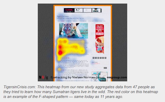
One of the widely used ways you can use in arranging email content is the F-Shaped arrangement.
Use the right colors for favorable responses
All colors are pretty, but they hide a special power over us humans. Somehow, colors can affect us at a psychological level. And depending on what colors we see, they can evoke a variety of emotions.
Do you want to know more about how to effectively use colors in your marketing email designs? Neil Patel has a blog taking an in-depth look into the psychology of color. Almost everything you need about color in marketing design is there, so have a look and find the right colors for your marketing emails.
But remember, stick to the colors that align with your brand’s identity so as not to compromise your brand’s recognizability to your customers.
Include images
Images serve as a great way to visually represent the ideas your emails are conveying to your customers. Another thing to keep in mind is the number of images you use in your marketing emails.
According to an analysis by Constant Contact, three or fewer images is the sweet spot of how many images you can put into your emails for high click rate. But as much as possible, use images of your eCommerce brand and your products.
This is so you can promote and build your brand’s image for your customers to better understand what your business is all about.
Take advantage of white space
The cool part about design how the lack of something can already be as effective as the presence of something. What do we mean by that?
We’re talking about the white space in your email. As tempting as it may be for you to fill every nook and cranny with something for your customers’ eyes to look at, all the visual stimulation might prove distracting and too much.
Sometimes, less really is MORE.
Lead your consumers with directional cues
Have you heard of the saying—show not tell? With smart email design, you can direct your customers’ attention towards specific spots of your email.
Using key visual like arrows or pointing fingers is a great way to direct your customers’ attention towards a specific element. In your case, that would be your CTA.
Plan your design with visual hierarchy
Visual hierarchy is all about prioritizing on the important point of your marketing emails. You can do this by starting with the most important information you need your customers to see.
Use color and positioning to emphasize that information more. Finally, you can use different font sizes to show which pieces of information is more important than the other.
Place most of the important stuff at the top half of your email
Sometimes it isn’t enough to just use sizes and colors to emphasize specific parts of your marketing email’s content. So what’s the next best way to make sure your customers see the most important information first?
Simple—just put all the important parts of your email content on the top half of your email. This way, you can catch the interest of your customers the first few seconds they start reading.
Always do A/B testing
Finally, you can never do enough A/B testing. Always test which variations of your email designs perform the best in both appeal and conversion rate.
Takeaways:
While email marketing does a great job as a marketing tool, style is also a big factor in its success. Marketing qualities such as engaging content and special deals work hand in hand with well-thought-out designs.
In the end, email design is the beautiful garnish and plating that makes your content—the main meat of the dish—shine. Now, optimizing your marketing email designs is one thing, but are your email marketing strategies bringing out the full potential of your emails?
Find the right email marketing strategies for your eCommerce business by scheduling a free 30-minute call with us!
Resources:
Web Design has an in-depth guide for designing emails. So, if you ever need something like a detailed instruction manual when it comes to marketing email design, then this is what you need!
If you’re looking to create effective marketing email designs without having to start from scratch, Send Grid has a bunch of Email Marketing Templates you can use!
Do you need help from an expert? Skillshare has an online course about Designing Effective Emails.


