 Growing your list with email pop-ups but can’t seem to get the results you want? We know the feeling.
Pop-ups can easily interrupt your visitors’ browsing experience if you don’t do them right. It could also stop you from building a strong list.
In this article, we’ll show you some of the best pop-up practices to boost your conversion rates.
Let’s dive right in!
What are Email Pop-ups and Why Do You Need Them?
First things first, what is an email pop-up? An email pop-up is an overlay that is displayed on top of a webpage, usually darkening the page behind it with a shadow. This is so the attention is mostly on the popup. The goal of an email pop-up is to build a healthy email list (a.k.a. an email list that only contains visitors that are truly interested in your products and offers.) Email pop-ups always provide an opt-in form that asks for a visitor’s email address. Some brands request additional contact information, such as a first name, phone number, or birthday. This information can be used to better personalize the customer’s experience and target certain leads for future communication. Here are the best email pop-up practices that you can put into play.6 Best Practices to Improve Your Email Pop-up Conversion Rates
1. Use Multi-step Campaigns
With marketing content, from sales pages to blog posts, you often need plenty of text to encourage prospects to the next stage in their customer journey. But that’s not the case when it comes to pop-ups. The less text you have, the better. Pop-ups typically interrupt a visitor’s browsing experience, so the last thing you want to do is make visitors read a huge chunk of text. You can create a much better user experience by spacing out your text. To do this, break the email subscription flow into different pages—like in the email pop-up example below. Another reason these pop-ups are so effective? They play into visitors’ innate need for autonomy.
With the first pop-up, visitors can choose if they’d like to participate or not—respecting their decision to opt in or out. This is a powerful conversion tactic that can fuel conversions and brand loyalty.
2. Highlight Your Unique Selling Propositions
Your pop-ups should talk up your USPs to show visitors exactly why they should subscribe to your list. Every visitor who lands on your site will unconsciously ask themselves, “What’s in it for me?” By highlighting your USPs with a pop-up, you make sure visitors can’t miss the biggest benefits. Check out below how Brand Growth Experts highlights their USP on their pop-up.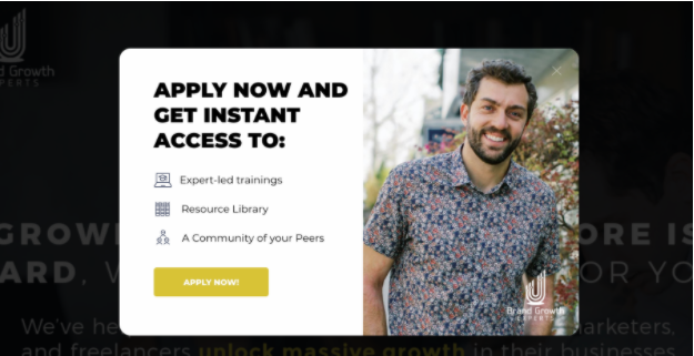
3. Be Creative with Your Offers
A unique offer can bring an element of surprise, capture your visitors’ attention and boost your conversions. Most ecommerce stores offer 10% off and free shipping. These offers are classics because they work. But if you want to stand out and be different from your competitors, try to get creative with your incentives. However, this doesn’t mean that you have to offer a discount that’s too big (e.g. 50% off). This can destroy a visitor’s trust by making people question if your product is worth it. Instead, A/B test different incentives and see which one works best. A/B tests refer to testing two or more distinct options with visitors to see which ones perform best. The most effective incentives target visitors at the right time, based on their current stage of awareness. (Are they unaware, pain aware, problem aware, solution aware, or most aware users?) Here are a few ideas:- Free full-sized products
- Free product samples
- Bundles – buy X and get Y for free, 50% OFF, or 25% OFF
- BOGO – buy one, get one free
- Extended guarantees (such as providing protection for two months)
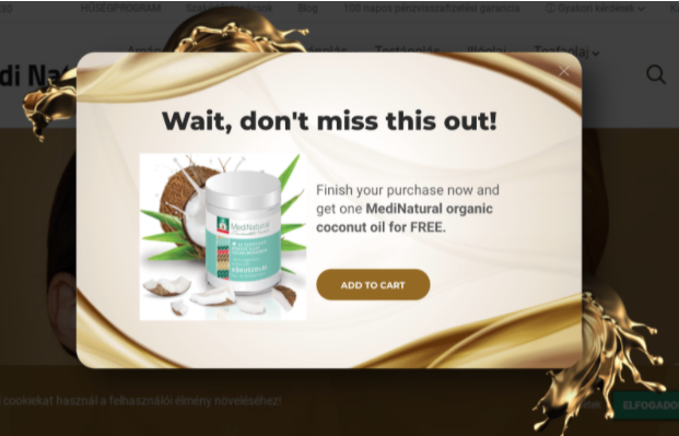
4. Personalize the Design of Your Campaign
People can quickly spot a stock photo—which often comes across as minimal effort and bland. Instead, use images of people using or sporting your product. These photos immediately connect with your visitors. It helps them visualize how they can use your products too. Use unusual-shaped templates, bold hues, and high-quality design elements to make your pop-up more attractive and drive your conversions. For example, if your pop-up is dark (black for instance), make the overlay lighter. Contrast your button color so both the pop-up and the call-to-action are super visible.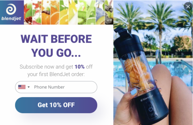
5. Capture abandoning visitors before they leave
Pop-ups are awesome for leading a visitor further along their customer journey. A customer journey refers to how a customer experiences your brand: from their first introduction to when they become a loyal, repeat customer. For example, guide your visitors to buy one of your products with a pop-up that tackles the dreaded abandoned cart. To do this, display exit-intent pop-ups with a discount code. Exit-intent technology tracks your visitor’s mouse movement. When your visitor’s mouse goes to the top of the page (to the exit button), your pop-up will appear. It will display a secondary offer and give visitors another chance to opt-in.6. Use Teasers as a Gentle Reminder
A teaser can appear in the corner of your visitor’s web browser after closing a pop-up without engaging. From the edge of their screen, a teaser quietly reminds them of your deal without disrupting their browsing experience. Check out a teaser in action here: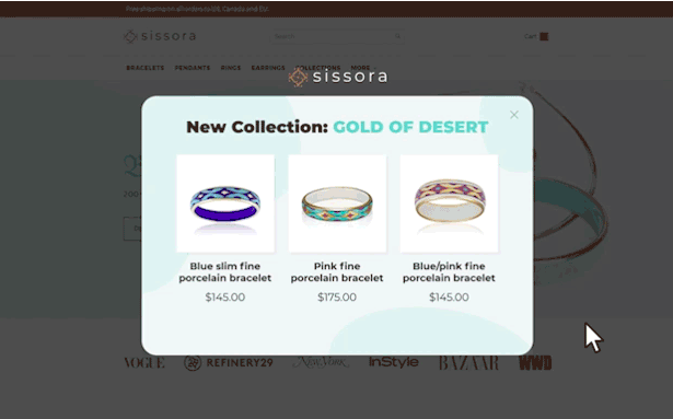 Now that we’ve walked you through the best tactics for creating high-conversion popups, let’s review what we’ve learned.
Ace Your Email Pop-up Conversions
Email pop-ups are a wonderful way to grow your email list. But it’s easy to miss your opportunity to max your conversions and grow your subscribers. Poorly timed messages, bad designs, and clunky content can easily put off visitors. But with these six best practices behind you, you can quickly build a strong list of engaged subscribers that are perfect for your products. Author Bio: Nikolett Lorincz is a Digital Marketer at OptiMonk, the #1 eCommerce popup tool. She is obsessed with content marketing and loves creating educational content for marketers and ecommerce stores.Key Takeaways
Lifecycle marketing is responsible for the long-running and sustainable eCommerce success of many 7 to 8-figure brands.
Customer-centricity is key to future-proofing your DTC store.
Customer retention is more cost-efficient and overall presents a more long-term and sustainable growth solution for eCommerce businesses.
Leverage direct marketing channels to establish direct communication with your customers as well as bring forward products and services that they would be interested in.
Omnichannel marketing is important to help tie all your existing marketing channels together for a seamless and consistent customer experience.
