The humble email has come a long way from its most basic purpose as just a means of communication. Even today, it still serves that purpose with best email design practices and flying colors—literally. What does this mean? Well, email has become more than just electronic mail. Ever since marketers started using emails for marketing, eCommerce email designs began their evolutionary journey.
And one of the most notable characteristics of an amazing marketing email that works is its design. Because nowadays, a generic eCommerce email with nothing but text with one or two stock photos just won’t cut it. But wait! This doesn’t mean you can just slap a popular design you’ve seen countless times onto your marketing emails and just roll with it.
Because if you want your emails to convert, they need to be effective email designs.
And what makes marketing emails effective?
It’s when they’re optimized.
So how can you go about optimizing your marketing email designs? What should you do to get started? How will optimizing your email design benefit your eCommerce brand, exactly?
All of these questions will be answered later on. But first, you need to understand why you should optimize your email designs in the first place.
Why does your eCommerce brand need optimized email designs and why does this matter?
Ask yourself—do your customers deserve generic email designs from your eCommerce brand?
Or do your customers deserve emails that align with their interests and make them feel valued by your brand?
Also, will your eCommerce brand grow if you send forgettable marketing emails? Or does your brand deserve recognition from its customers?
If you believe your customers and your eCommerce brand deserve the best, then optimizing your marketing emails is the way to go!
Here are some points to consider:
You have a super small window of opportunity to make a good first impression on your customers.
While it would take you a few hours at best to come up with a decent marketing email design, you will only have a maximum of 50 milliseconds to capture your customers’ interest.
So how can you make every millisecond count through your email marketing designs?
You can reinforce your eCommerce brand’s image through your marketing emails
Speaking about leaving an impression, sending marketing emails is a great opportunity to showcase what your eCommerce brand is all about.
But how can you convey your brand’s core message to your customers through your email designs?
You can engage with customers at an emotional level
The colors you use, the sizes, shapes, and even the placement of different design elements can make or break your marketing email. And that’s not just from an aesthetic standpoint, but it can also delve into the world of human psychology.
So how can you maximize the positive psychological effect your email designs can have on your customers to your advantage?
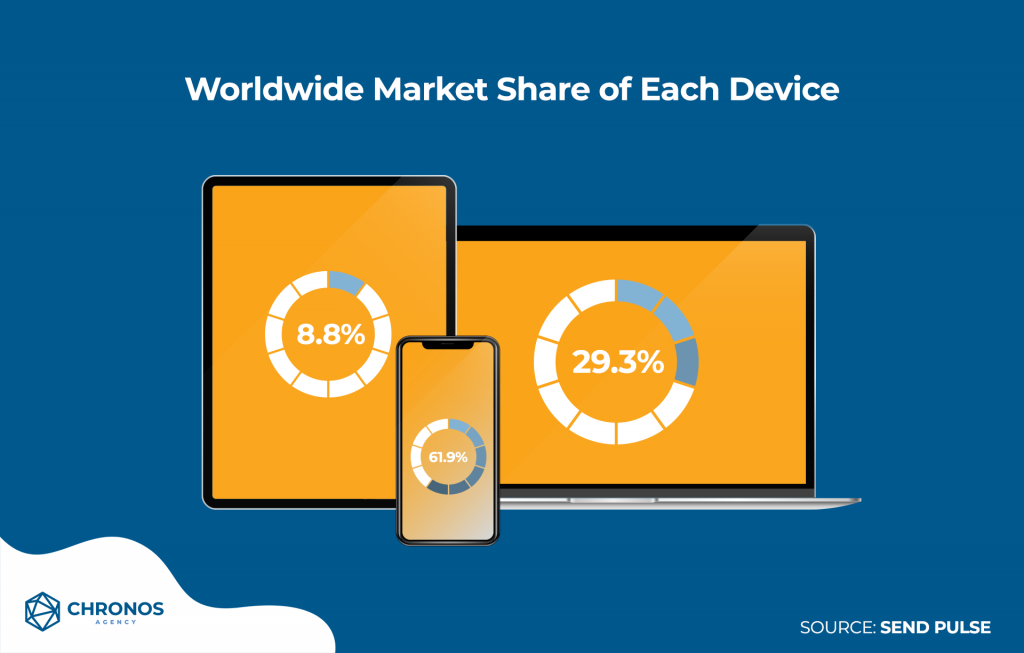
How your emails look on mobile devices are just as important as how they look on desktop computers
Let’s face it, we are living in an age where almost nobody can leave their homes without their mobile devices.
When it comes to mobile users, the amount of time they spend online is 200% longer compared to desktop users.
So if you want to maximize your brand’s reach, you’re going to have to think way out of the box and out of the confines of a desktop computer.
Because while mobile devices are just as capable as desktop computers when it comes to opening emails, mobile devices come with their own set of design rules and limits you’ll need to remember.
If your email looks good when viewed from a desktop computer, there’s a good chance it won’t look that good when viewed from a mobile device.
So, how can you get your marketing emails past that hurdle?
These are just some things your eCommerce brand should keep in mind when it comes to maximum email design optimization.
So now you are probably asking yourself—is it all worth it?
The only way for you to find out is by knowing the benefits your brand will be getting out of this.
How can well-designed marketing emails benefit your eCommerce brand?
This is the best time for you to learn about responsive email design.
To put it simply, an email with a responsive design is an email that can be displayed properly no matter what device you view it from. Whether you’re viewing it via a computer or a smartphone, all of the elements are in their proper place.
Think of old-school websites that aren’t responsive. When you view them using your phone’s browser, you have to zoom in and scroll up, down, left, and right just to be able to continue reading a part of it.
Heck, reading a physical book would feel more convenient at this point.
On the other hand, when you’re viewing a responsive website on your own, it’s easy as pie. You get to soak it all in just by scrolling up and down because all the website’s elements fit your screen perfectly.
So when an email design is responsive design, your emails are at their very best when they are finally being viewed by your customers.
But what kind of benefits can these responsive email designs give your eCommerce brand, you ask?
Well, with responsive designs your brand can have:
Enhanced User Experience
With responsive email design winning over mobile users, 47% of email opens would be on mobile devices.
You could expect to see up to 70% of your marketing emails being opened on mobile devices.
This is all because of the portability of mobile devices and the convenience of viewing emails on these devices.
So the more that your email designs enhance the user experience, the more that mobile users will become receptive to your marketing emails.
Increased Conversion Rate
Responsive email design is all about displaying your content properly on any device, right?
That in itself already plays a big role in increasing your conversion rate.
How big of a role?
Well, after the company Skinny Ties adopted responsive designs for their marketing emails, their overall conversion rate increased by 13.6%, while their bounce rate dropped by 23.2%.
As for the popular eCommerce store O’Neill Clothing, they saw an increase in their conversion rate by 65.71% on iPhone devices.
For Android devices, they saw an increase in their conversion rate by a jaw-dropping 407.32%!
And the best part? These metrics were achieved over the course of three weeks after they adopted responsive email design.
Bigger Sales
Let’s have the two companies from above again for this one. Skinny Ties increased their revenue by 42% through all device with responsive design emails.
Then for O’Neill Clothing, they increased their revenue by 101.25% through iPhone devices while their revenue increased by an astonishing 591% through Android devices!
This shows that convenient user experience, especially when it comes to viewing your emails from different devices, navigating through them, and taking in the content, plays a huge role in encouraging your customers to take the next course of action—making a purchase.
Higher Click-to-Open Rates
With better-looking marketing emails, your customers will be more willing to read them whether they’re being viewed from desktop, mobile, or other devices.
In turn, once your brand has built a good reputation for using responsive emails, your customers will be more willing to open the emails you send them.
To back that up, studies show responsive design emails have a 21% higher click-to-open rate (11.9%) than emails without responsive designs (9.8%)
Reduced Unsubscribe and Spam Complaint Rates
Of course, better-looking emails mean more satisfied customers.
Just how much do your customers care about how your emails look?
Well, 30% of users would unsubscribe from your email if your emails don’t display well on their devices.
Because it’s totally easy to mark emails as spam if they don’t like them.
So imagine if it were YOUR marketing emails your customers marked as spam.
That’s going to do a lot of damage to your reputation as an eCommerce brand
And that’s the last thing you would want to happen to your business, right?
With benefits like these, you must be more motivated than ever to learn more about how you can optimize your email designs.
So, are you ready?
What are some best practices for designing effective marketing emails, and what are some things to avoid?
Let’s start with some general tips:
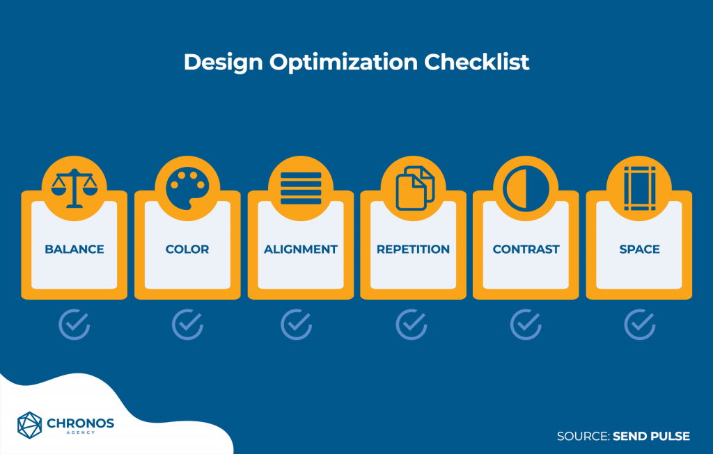
Make a checklist when conceptualizing a design
List down things like balance, color, alignment, repetition, contrast, and space.
This way, you can make sure your design is optimized in those areas. It’s a way to organize your thoughts so you won’t feel overwhelmed along the way.
Your checklist will also serve as good reference material for yourself especially when you’re trying to strike a balance in coming up with a design that you want versus a design that aligns with your brand.
Be bold with your designs
While it’s tempting to just go with a design that has been used countless times by other eCommerce brands just because they work, it’s important to stand out from the crowd by taking that big step into a new direction.
When in doubt, you can always conduct A/B testing with your marketing email designs. So don’t be afraid to experiment with different ideas while sticking to your company brand.
The more unique your designs are, the more that recipients will enjoy looking forward to your next emails!
Less is always more
Minimalism somehow always comes out at the top. There’s just this magical feeling knowing that you were able to accomplish so much with so little.
When it comes to email design, concepts that are simple yet effective would see positive reception among recipients.
You know your email design works when you can confidently strip away all the needless clutter and it STILL looks good.
So the next time you’re working on email design, try taking two design elements away from it before you finalize it . If your email design still works without them, then remove them.
“The Good and the Bad” examples in email design
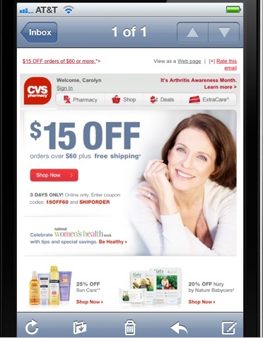
The Good: CVS Pharmacy
And here’s the same email but as viewed from a mobile device:
Why is this email design good?
- The CTA is easy to see and click
- There are other navigation options linking to the pharmacy’s website or other deals
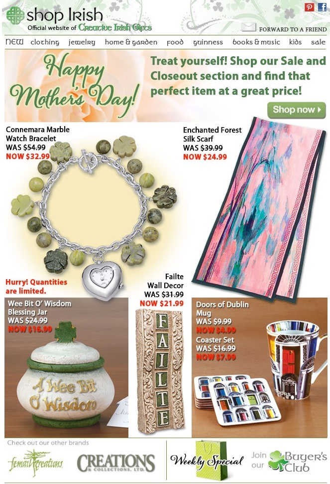
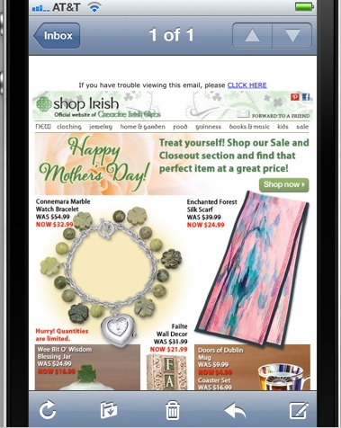
The Bad: Shop Irish
And here’s the same email but as viewed from a mobile device:
Why is this email design bad?
- There is a lot going on with no clear flow
- The images of the products are too big
- The CTA is buried and smooshed between elements making it hard to immediately notice
When it comes to email design, there’s more than meets the eye
Looks can be deceiving, and for marketing email design we mean that in a positive sense.
When your customers read your emails, there’s a lot more of the intangible stuff that goes on than what they would see on the screen of their devices.
The effect email design has on your customers is closely tied to how your designs would make your customers feel.
Do they feel at ease when they go through your email?
Do they find convenience when navigating through the graphics and content you painstakingly crafted?
Do they feel compelled to click/tap on your CTA after you evoked the right emotions from your customers through your email designs?
When you can confidently say YES to these questions, that’s when you know your marketing email designs are finally at their best.
Resources
Are you looking for some email designs to help inspire you?
Canva’s article 50 of the Best Email Marketing Designs We’ve Ever Seen is just what you need!
Do you want to improve your email’s ability to engage with your customers at a deeper level?
IndieMark’s article Emotional Email Design and Copywriting: The Secret to Driving Engagement and Sales is sure to enlighten you.
Are there still some wrinkles in your emails that need ironing out?
Vertical Response’s article Do’s and Don’ts of Email Design should help you with that.
Are you looking for ready-to-use email templates to save you the trouble of starting from scratch?
Magenticians’ article 10 Best Email Templates for Ecommerce Stores is a great place to start.
How about some books to satisfy your hunger for knowledge?
Active Campaign’s list of 10 Books That Will Improve Your Email Marketing has more than enough reading material you will find helpful.
Do you have what it takes to be a diligent student for mastering the art of emails?
Envatotuts+’s extensive list of courses for Mastering HTML Email should cover almost everything you need to become the best!
And finally, we’re not planning on just dropping you off here.
When it comes to email marketing, you’re going to need to leave it in the capable hands of an experienced group of people if your eCommerce brand is hoping to pump out one effective email marketing campaigns after the other.
What you need is an email marketing agency! And since we just so happen to be one, please don’t hesitate to contact us and schedule a FREE 30-minute strategy call with us. We would be thrilled to lend you a helping hand with your email marketing!


