UPDATED, 20 FEB 2023—With ad spend on the rise this 2023, the top priority objective in the eCommerce space is to accomplish more with less. In other words, make more money with less expenses.
No matter how expensive digital marketing gets, email marketing will always have your back. It boasts generously high ROI for little expense—with an average of $36 returned for every $1 spent!
It’s for this reason that amidst the clamor of aesthetic graphics, viral memes, 2-minute videos, and witty quips—email is still the one marketing tool that remains effective regardless of seasonal trends.
It isn’t just about any old generic email newsletter, email marketing has evolved into an elegant solution for eCommerce businesses to have these days.
The role of email marketing to eCommerce brands can’t be denied, it has the potential to sustainably generate 30-40% of your eCommerce store’s overall revenue, when done right.
With the email automation life cycle and customer segmentation thrown into the mix, you as a brand can now optimize your customers’ preferences to build long-lasting relationships with their brand with ease.
If you want to rehash your current newsletter strategy, these tips will surely get you to where you want to be.
The question is, how do you stand out from a crowded inbox? The competition for attention these days is greater than ever. Better yet, how do you create a newsletter that people would actually want to open?
Without further delay, here are 8 tips for shaping up your email newsletters this 2023:
1. Keep it Short and Simple
The Miniskirt Rule applies to email newsletters too! They should be ‘long enough to cover what’s necessary, but short enough to keep things interesting.’
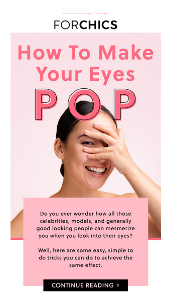
Remember, your content should be able to convey enough details and information but short enough to avoid being boring. Here’s an example from one of our clients—ForChics:

About this design:
- A brief copy that hooks readers and hints at the value of the content the follows
- Easy-to-see CTA button whose color stands out from the email’s overall color scheme
2. Don’t Overload it With Graphics or Images!
Sure, graphic elements make your email newsletters attractive and fun to read, but keep everything in moderation!
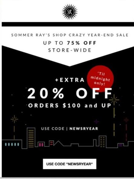
Remember—the main goal of a newsletter is to inform your customers. From another one of our clients, Sommer Ray’s year-end sale email is a great example:

About this design:
- Simple and straight to the point
- Less is more—rather than filling up the whole email with graphics or product images, the big discount headline is already enough to catch your subscribers’ attention and tell them what they need to know
3. Stay Consistent with Your Brand
Your customers should be able to recognize your brand at a glance regardless of the seasonal theme.
Don’t stray away from your colors, your design elements, and your visual guidelines.
Always align your email newsletters to your brand—this will help in making your business more recognizable and build your brand presence with your customer base and tell your brand’s story.
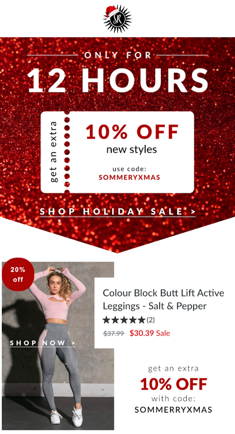
Here’s another great example from Sommer Ray’s Shop:

About this design:
- Incorporates a Christmas-themed design without it drowning out the brand’s email design standards
- Stands out from the usual off-season emails, reminding subscribers it’s indeed a special sal
4. Don’t Forget the Preview Pane
Only the top 200-300 pixels of your message are shown first, so you have to make those count big time. Make sure you have the important parts of your email newsletter fall into this preview range.
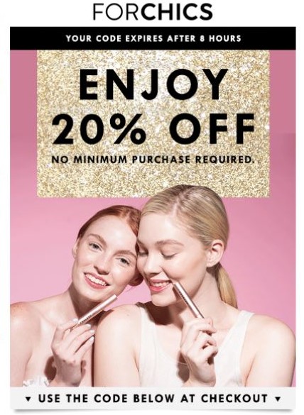
This ForChics discount promo email did it right:

About this design:
- Important details such as the code expiration and discount offer are at the top major portion of the email
- Simple yet still effective design that’s easy on the eye
5. Make it Easy to Read and Scan
Not everyone has the time to sit down and read through everything in your newsletter. Often, emails are opened via mobile phones, and online users just browse through their emails. Why not make their newsletter experience more convenient?
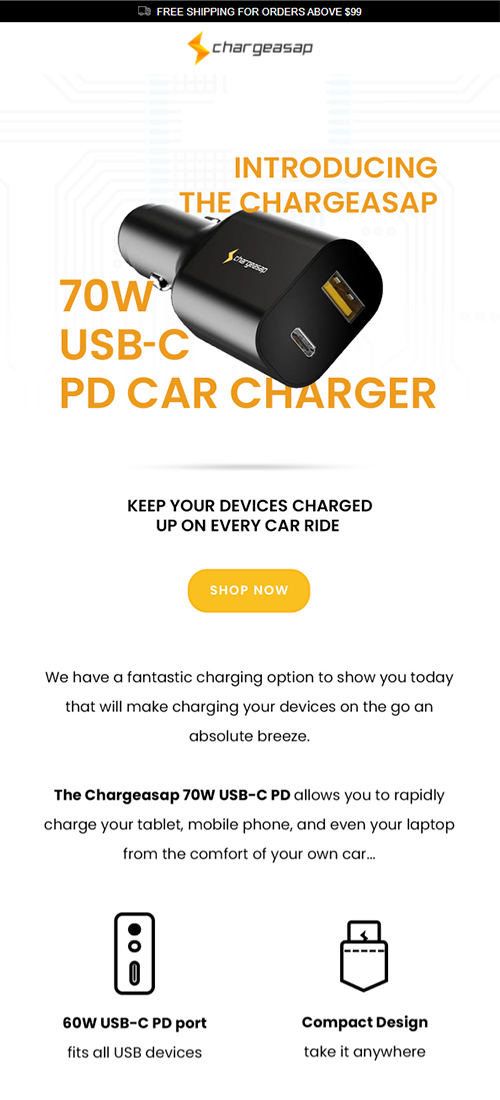
Here’s a straightforward yet engaging example from our client ChargeASAP

About this design:
- Simple but with relevant and engaging visual content
- Aside from images and GFX, you can squeeze in videos for more engagement
- Smart use of white space and image so there’s more to see and less to read
- Nicely contained copy that’s straight to the point and hooks readers
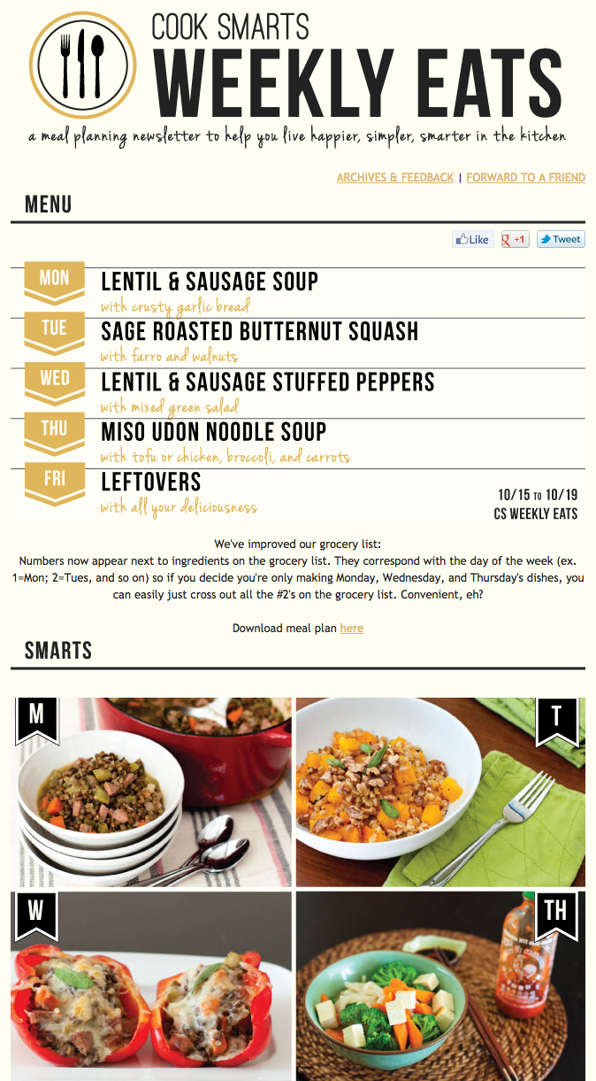
6. Include a Table of Contents
Even if your newsletter can be read quickly, there are still some people who just don’t have the time to even scan through your newsletter for that piece of information they’re looking for.
So, including a table of contents and using anchors to link each item to their corresponding sections would be super convenient for your customers.
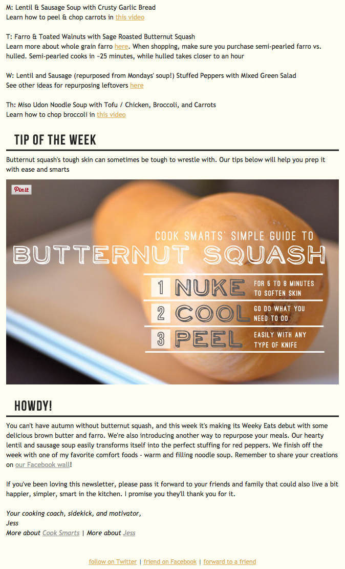
About this design:
- Simple and well-organized sections of content
- Images are simple and attractive, showing what each of the menu items looks like to readers
- Forward to a friend CTA at the bottom opens more opportunities to expand the brand’s email list
7. Optimize for Mobile Commerce (mCommerce)
Mobile devices accounted for 58.99% of web traffic in Q2 of 2022.
Meaning the future of mCommerce remains one of the brightest channels for eCommerce brands to tap into. So it’s imperative that brands should scramble to capture this opportunity.
So, if you’re not optimizing your email newsletters for mCommerce this holiday roll-out, be prepared to risk missing out on a huge chunk of the revenue your brand could enjoy come 2023.
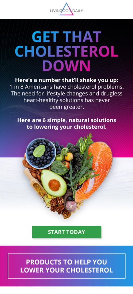
Here’s a mobile-friendly email design from our client Livingood:
About this design:
- Single-pane design allows it to retain its design integrity when viewed on a smaller screen.
- Each of the sections is clearly defined
- Smart use of different background colors to break up the newsletter into easier-to-read portions
8. A/B Testing is Life!
Whether you’ve read this time and time again in our articles or if this is your first time, we cannot stress enough how important it is for you to test your emails.
Some questions you can start with:
- Which design choices worked better?
- GIFs or static images?
- What’s a better way to arrange the content in your newsletters?
Just a reminder, Your first or second or even your third newsletter design might not get you the metrics you want on the get-go.
Continuously testing different email newsletter designs for your 2023 email game plan can help you find and create the design that performs the best and is well-received by your customers.
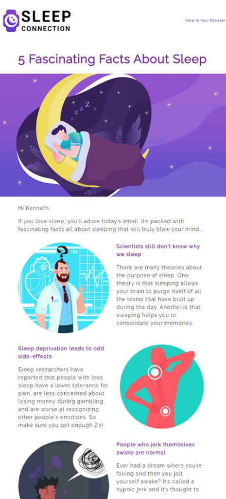
Here’s a top-performing educational content type email from our client Sleep Connection.
About this design:
- Clear layout with great use of the zigzag presentation of multiple text sections.
- Attractive copy that emphasizes the value of the content and products the brand offers.
Create Action by using words alone
Lastly, an extra tip from us is how you optimize your CTAs. Merely putting links is not enough.
How do you get your customers to click on your links? Rather than going for the generic click here links, go for actionable language like read more, donate, or unsubscribe.
If you’re having a problem with getting your creative juices flowing, here are 3 eCommerce newsletter ideas that really stood out in 2019 to inspire you and get your marketing team started on your email newsletters for 2023.
One of Many Steps Towards Fully Engaging Your Customers
Email newsletters work so well in establishing a direct line of communication with your customers.
Your newsletters act as the gateway for your customers to convert into buyers and maybe even loyal customers by helping them get to know more about your brand, products, and services regularly.
As you continue sending newsletters with relevant and quality content to your customers, you are sure to build a solid following, which in turn solidifies your foothold as an eCommerce business on the internet.
Aside from killer newsletters, what exactly makes an overall successful email marketing system? Learn about the inner workings of what makes 8-9 figure email systems tick by downloading our guide today—it’s free!
Do you want to maximize the effectiveness of all the other steps of your email marketing strategy?
Please don’t hesitate to schedule a call with us! We would be happy to do your email marketing for you.
References:
Key Takeaways
Lifecycle marketing is responsible for the long-running and sustainable eCommerce success of many 7 to 8-figure brands.
Customer-centricity is key to future-proofing your DTC store.
Customer retention is more cost-efficient and overall presents a more long-term and sustainable growth solution for eCommerce businesses.
Leverage direct marketing channels to establish direct communication with your customers as well as bring forward products and services that they would be interested in.
Omnichannel marketing is important to help tie all your existing marketing channels together for a seamless and consistent customer experience.

