Many eCommerce brands are not short on traffic. They are short on conversion.
The pop-up decides who ends up on your list. This guide comes from Chronos Agency, a Klaviyo Master Elite Partner that has served 500+ DTC brands.
Visitors arrive, browse, and leave without taking action. Over time, that gap compounds into slower list growth, weaker retention, and higher pressure on paid acquisition.
One of the earliest points where this leakage happens is the website pop-up.
Pop-ups shape a visitor’s first interaction with a brand. When they appear at the wrong moment or ask for too much too soon, they are ignored. When they are aligned with how people actually behave on site, they become a reliable entry point into email, SMS, and downstream revenue.
These patterns surfaced repeatedly in Chronos’ work with high-growth eCommerce brands and were discussed publicly when Chronos’ CEO joined Bringing Business to Retail, a podcast hosted by retail strategist Salena Knight.
The observations shared there mirror what shows up in live storefront data: timing, structure, and intent alignment matter more than creative polish.
What follows breaks down how pop-ups perform in practice, using observed behavior and measured outcomes across Chronos-led experiments and lifecycle programs.
BFCM War Plan Workshop · Live on Zoom
Leave 19 Oct with your BFCM decisions made and every email and text ready to build
Bring the plan you have. We build the rest with you, live, from an offer that protects your margin to the plan that brings sale buyers back in January.
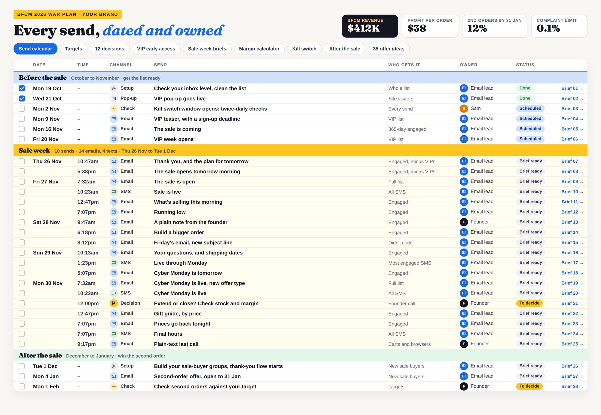
- Mon 19 Oct · 11am ET · 4pm UK · 11pm SGT
- Doors close Sun 18 Oct, 11:59pm ET


Why Pop-Ups Annoy Customers (And How That Hurts Conversion)
Pop-ups don’t annoy customers by existing. They annoy customers when they interrupt before value is established.
From a visitor’s point of view, the most frustrating pop-up experiences share the same traits:
- They appear immediately, before the page has loaded or been understood
- They demand attention without context
- They repeat on every visit, even after dismissal
- They obscure the content the visitor came to see
When this happens, the pop-up is perceived as friction, not assistance. The instinctive response is to close it as quickly as possible, often without reading a single word.
That behavior has downstream effects. Visitors who feel interrupted are less likely to engage further, less likely to trust the offer, and more likely to leave the site entirely. Over time, this reduces the effectiveness of pop-ups and weakens the first impression of the brand.
This is why pop-up performance is closely tied to timing and relevance. A message that appears too early feels intrusive. The same message shown after a visitor has explored products or content feels contextual.
Annoyance is not caused by the format. It’s caused by poor alignment with intent.
Understanding when annoyance happens makes it easier to understand why timing is the most important variable in pop-up performance.
Why Pop-Ups Commonly Underperform
Most pop-ups fail because they interrupt before visitors are ready.
Session data across multiple storefronts shows that non-converting visitors tend to exit within predictable windows. When pop-ups trigger immediately or without regard to that behavior, they are closed reflexively.
In one example discussed on the podcast, session analysis showed visitors leaving around the same point in their visit without purchasing. Adjusting the pop-up trigger to appear just before that drop-off window materially changed engagement.
“We saw visitors consistently leaving at the same point. Triggering the pop-up just before that exit made the difference.”
, Josh Chin, CEO & Co-founder, Chronos
This pattern appears across categories. Pop-ups perform when they respect attention, not when they race to capture it.
When Should Your Pop-Up Show?
Show your pop-up after the visitor has seen why they came, and before the point where most non-buyers leave. For most ecommerce stores, that means a delay of about 5 seconds on desktop, a scroll trigger on mobile, exit intent as a backup on desktop, and no pop-up at all on cart or checkout.
Kiyoko Beauty’s winning pop-up test used exactly this kind of setup. The pop-up showed after 5 seconds on page, appeared once per day per user, and skipped visitors who were already subscribed (see the full Kiyoko test).
Time delay: how many seconds to wait
Start at 5 seconds on desktop. That is long enough for the page to load and the visitor to read the first screen.
Then tune it with your own data. Check the average engagement time on your top landing pages in Google Analytics, and set the delay a little shorter than the point where non-buying sessions drop off.
On a new website with no session history, use 5 seconds and a once-per-day cap. Revisit the delay once you have a few weeks of traffic to read.
Scroll depth: wait for real interest
A scroll trigger shows the pop-up once the visitor has moved through part of the page. It suits pages people read or browse: blog posts, collection pages, and long product pages.
Start around 50% scroll on product and collection pages. On blog posts, start around 60 to 70%, so the reader has had most of the article before you ask.
Exit intent: a second chance on desktop
Exit intent fires when the cursor moves toward the top of the browser, as if to close the tab or go back. Use it as a backup for visitors who did not see or did not act on your timed pop-up.
Phones have no cursor, so classic exit intent does not fire on mobile (Klaviyo Community). Give mobile its own scroll or time trigger instead.
Mobile: keep the first screen clear
Google’s Search Central guidance says pop-ups that cover the page can make content hard for search engines to understand and may lead to poor search performance. Google recommends banners that take up only a small fraction of the screen (Google Search Central).
On mobile, wait for a scroll before showing anything. Use a small teaser or bottom banner that opens the full form when tapped.
Page type: match the trigger to the visit
Visitors arrive on each page type with a different goal. Set a separate trigger for each one.
| Page type | Desktop trigger | Mobile trigger | Why |
|---|---|---|---|
| Homepage | 5 second delay, exit intent as backup | Small teaser after 30 to 50% scroll | Visitors are orienting. Give them the first screen first. |
| Collection page | 50% scroll or 5 second delay | Teaser after 50% scroll | Scrolling a collection signals real browsing. |
| Product page | 50% scroll, exit intent as backup | Teaser after 50% scroll | Let them see price, photos and add to cart before you ask. |
| Blog post | 60 to 70% scroll | Teaser after 60 to 70% scroll | Readers who reach this point want more of what you publish. |
| Paid ad landing page with an offer | Off, or exit intent only | Off | The page already carries the offer. |
| Cart and checkout | Off | Off | These visitors are already buying. Do not interrupt them. |
Returning visitors: suppress and cap
Exclude anyone already on your email or SMS list. In Klaviyo, set the form to hide from existing profiles.
Cap how often the pop-up appears after someone closes it. Once per day per visitor is a sound starting point, and it is the cap Kiyoko used.
Set these rules before you test creative or offers. A strong pop-up shown at the wrong moment still gets closed.
Pop-Up Best Practices That Actually Improve Conversion
Once the causes are clear, improving pop-up performance becomes straightforward. The sections below focus on the few variables that consistently change outcomes when tested on live eCommerce storefronts.
1. Timing Is The Primary Performance Driver
Timing determines whether a pop-up is even considered.
Across Chronos’ testing, three trigger types consistently outperform static, immediate pop-ups when applied intentionally:
- Time-based triggers aligned to average session depth
- Exit-intent triggers for early disengagement
- Scroll-based triggers that allow product context first
The point is not which trigger is “best.” It’s whether the trigger is informed by real session behavior rather than guesswork.
2. Structure and Contrast Shape First Engagement
Once a pop-up appears at the right moment, structure determines whether it earns attention.
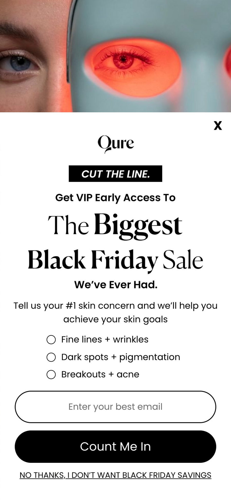
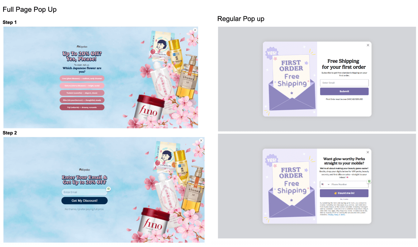
This showed up clearly in Chronos’ A/B testing for Kiyoko Beauty, where a full-page pop-up with a simple, curiosity-driven first step outperformed a standard modal across both the US and Canada.
Instead of immediately asking for an email, the pop-up opened with a single, lightweight question tied to product interest. That initial interaction created momentum before the form appeared.
The results were decisive:
- US (Desktop):
- Submit rate increased from 2.64% to 4.40 (+66.7%)
- Orders increased from 14 to 27 (+92.9%)
- Revenue per visitor increased by over 100%
- Canada (Desktop):
- Submit rate more than doubled (+105.3%)
- Step-1 engagement exceeded 26%, translating into materially higher revenue
These outcomes came from improving first engagement, not increasing discounts or adding friction.
3. Offer Value Needs To Match Intent
Offers influence conversion only once they cross a meaningful threshold.
Testing across Chronos clients shows that very small incentives the visitor has seen repeatedly fail to move behavior. At the same time, excessive discounts attract low-intent signups that underperform later in the lifecycle.
As discussed on the podcast, the shift happens when the offer feels materially worthwhile in context.
“There’s a point where someone who wasn’t going to buy becomes willing to consider it.”
, Salena Knight, Retail Strategist
The exact threshold varies by brand. What remains consistent is the need to evaluate offers based on downstream behavior, not just opt-ins.
4. Copy Should Reflect Why Someone Is There
Pop-ups perform better when copy mirrors visitor intent rather than announcing a promotion.
High-performing examples frequently open with prompts such as:
- “Shopping for yourself or someone else?”
- “Looking for a gift or something new?”
This framing slows the close reflex and invites engagement. The CTA becomes a continuation of the visitor’s thought, not an interruption.
5. Test Less, Learn Faster
Pop-ups present many variables. Most do not move results.
Across Chronos’ testing and client programs, performance gains consistently come from focusing on:
- When the pop-up appears
- What value is offered
Design and copy support these decisions. They rarely compensate for poor timing or misaligned incentives.
In the Kiyoko test, the winning variant did not introduce more variables. It focused on timing, first interaction, and offer alignment, and the data made the decision unambiguous.
6. First Interaction Should Reduce Form Friction
The strongest lift in the Kiyoko Beauty test did not come from visual changes alone. It came from delaying commitment.
In the full-page pop-up test, visitors were first asked a lightweight, curiosity-driven question before being shown an email or SMS field. That single interaction materially changed behavior.
In the US test, Step-1 engagement reached 11.67%, while final submission landed at 4.40%, compared to 2.64% on the standard pop-up. In Canada, Step-1 engagement exceeded 26%, more than 3× the standard pop-up baseline.
The takeaway is straightforward:
When visitors take a small action first, they are more likely to complete the form that follows.
This pattern held across regions and translated directly into higher submit rates, more orders, and higher revenue per visitor. Reducing friction at the first interaction changed the outcome of the entire funnel.
WHY THIS MATTERS FOR REVENUE
Pop-ups influence the quality of the audience that enters your lifecycle.
When they are aligned with behavior, they increase list growth, improve engagement, and strengthen downstream performance across email and SMS. When they are misaligned, they quietly cap the return on traffic you are already paying for.
Chronos’ broader case work shows this compounding effect clearly, from engagement recovery at StopWatt to lifecycle-led revenue growth at brands like Kiyoko, The Oodie, and Fenix.
FAQ
Do pop-ups still work in 2026?
Yes. Brands that align timing, structure, and value continue to see strong performance.
What matters more: timing or design?
Timing. Design supports conversion once attention is earned.
Should returning customers see the same pop-ups?
No. Segmentation reduces fatigue and improves opt-in quality.
Are discounts required for pop-ups to convert?
No. Value can take many forms, but it must feel relevant and worthwhile.
How many seconds should a pop-up wait before showing?
Start at about 5 seconds on desktop, then set it just before the point where non-buying visitors leave in your analytics. Kiyoko Beauty’s winning test used a 5 second delay with a once-per-day cap.
Should a pop-up show right away on mobile?
No. Wait for the visitor to scroll, and use a small teaser or banner. Google’s guidance says pop-ups that cover the page may lead to poor search performance.
FINAL TAKEAWAY
Pop-ups are not a cosmetic layer. They are an interaction point.
When they appear at the right moment, ask the right thing, and respect how visitors behave, they become a reliable conversion lever. When they don’t, they become background noise.
The difference is not creativity. It is alignment.
Chronos Agency is an email, SMS and push retention agency and Klaviyo Master Elite Partner for 8 to 9 figure DTC brands, and pop-up strategy is part of the ecommerce email marketing agency work we do for them.
Key Takeaways
Lifecycle marketing is responsible for the long-running and sustainable eCommerce success of many 7 to 8-figure brands.
Customer-centricity is key to future-proofing your DTC store.
Customer retention is more cost-efficient and overall presents a more long-term and sustainable growth solution for eCommerce businesses.
Leverage direct marketing channels to establish direct communication with your customers as well as bring forward products and services that they would be interested in.
Omnichannel marketing is important to help tie all your existing marketing channels together for a seamless and consistent customer experience.